brief
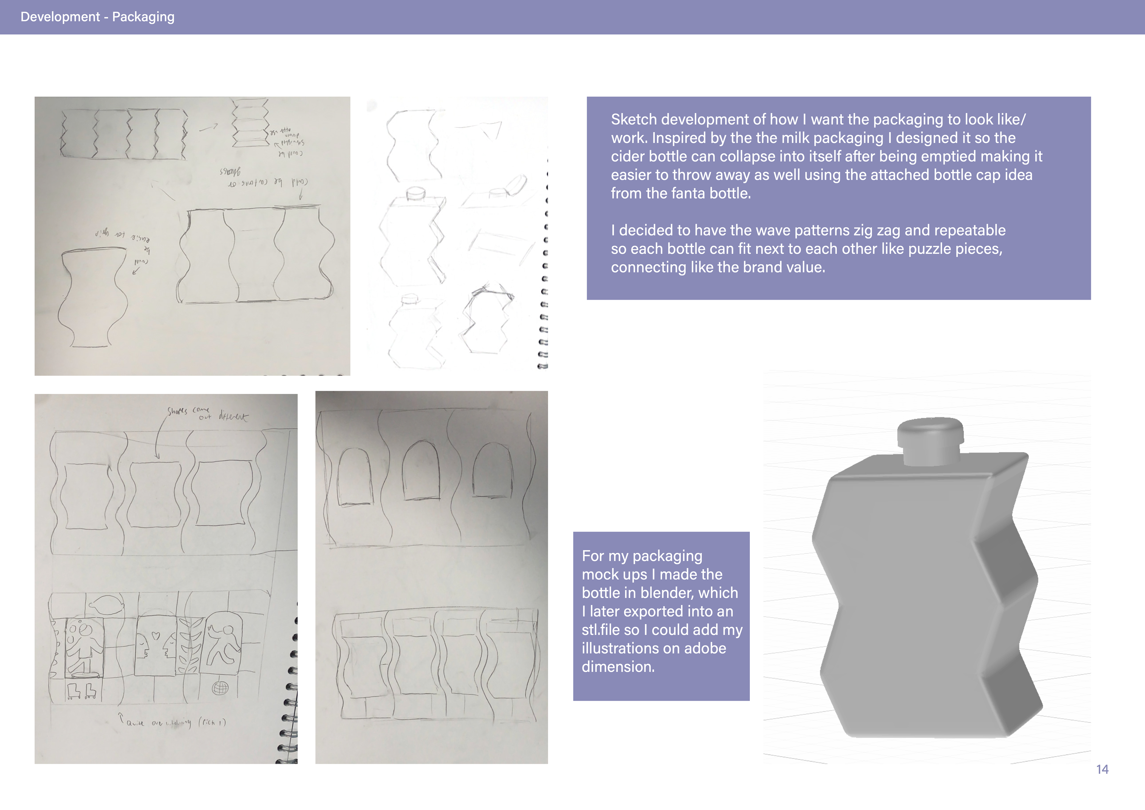
My submission for BrandOpus’s cider brief. the aim was to create a new and innovative cider brand to connect to younger audiences. This project was also my first time using blender to create the bottles.
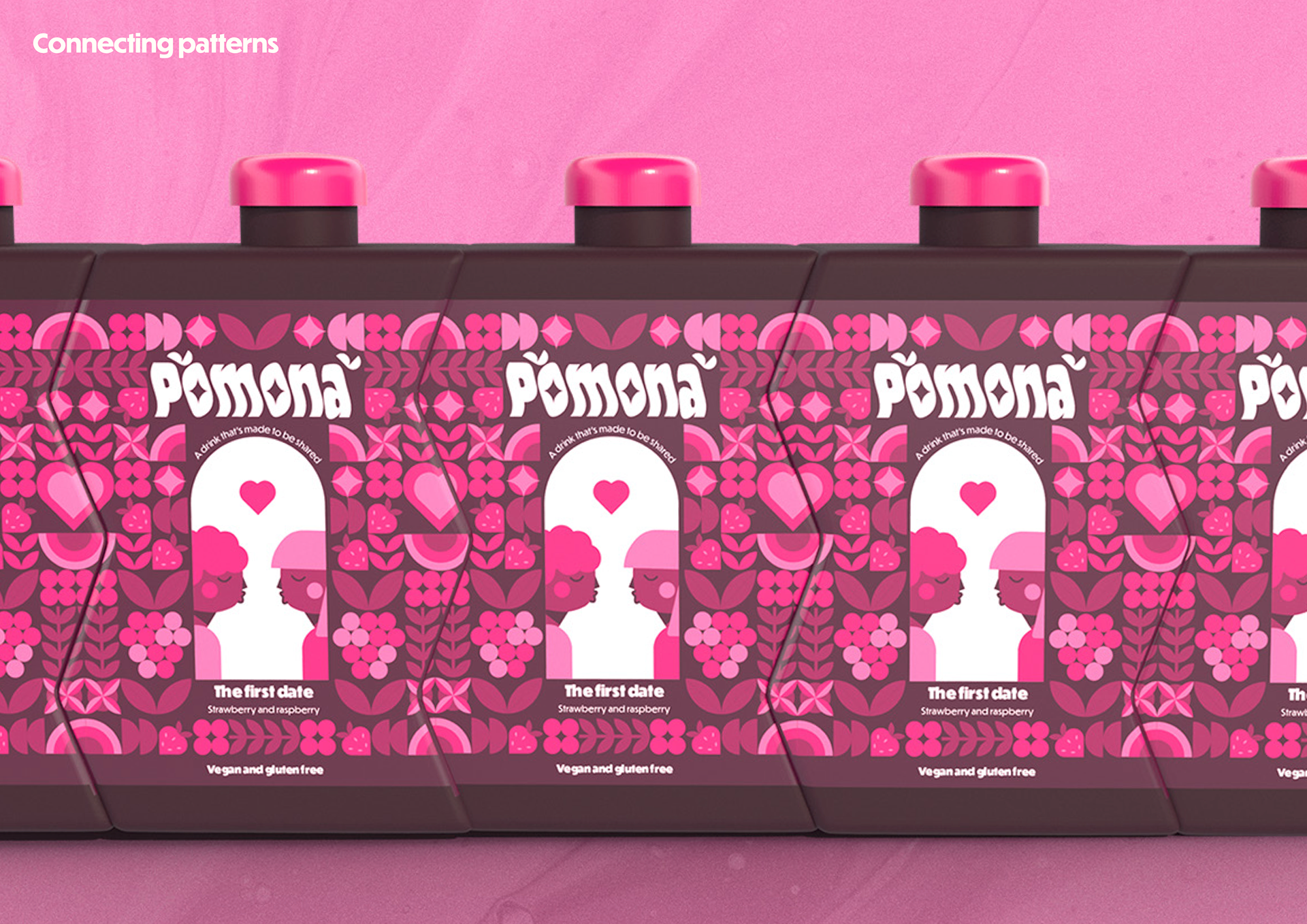
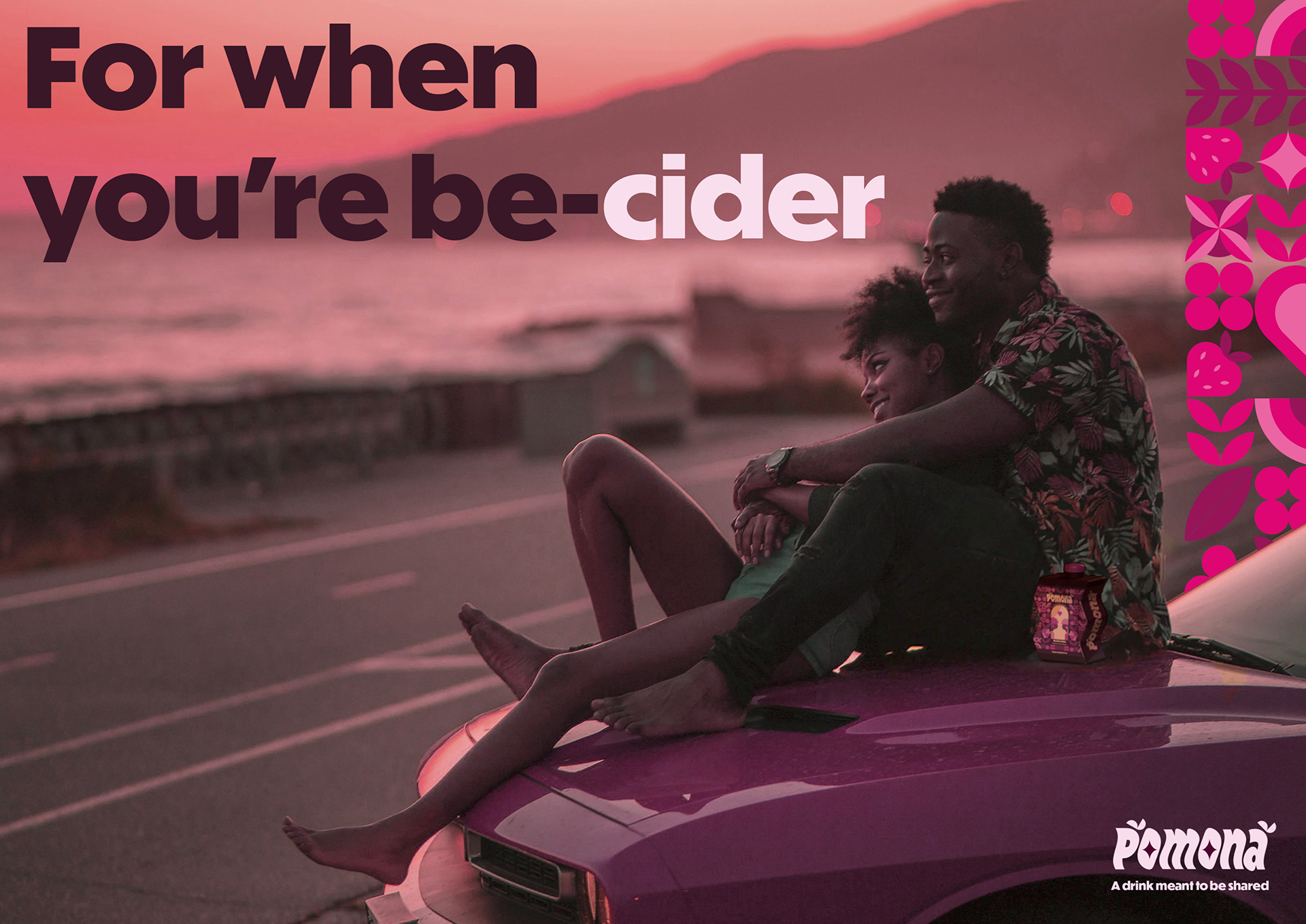
Pomona, named after the Roman goddess of orchards, is a cider brand that branche's away from the conventional ideas of cider. Pomona’s main core value is how cider connects people, whether it’s a pub crawl with friends to an awkward first date, Pomona tell the stories of those who love cider.
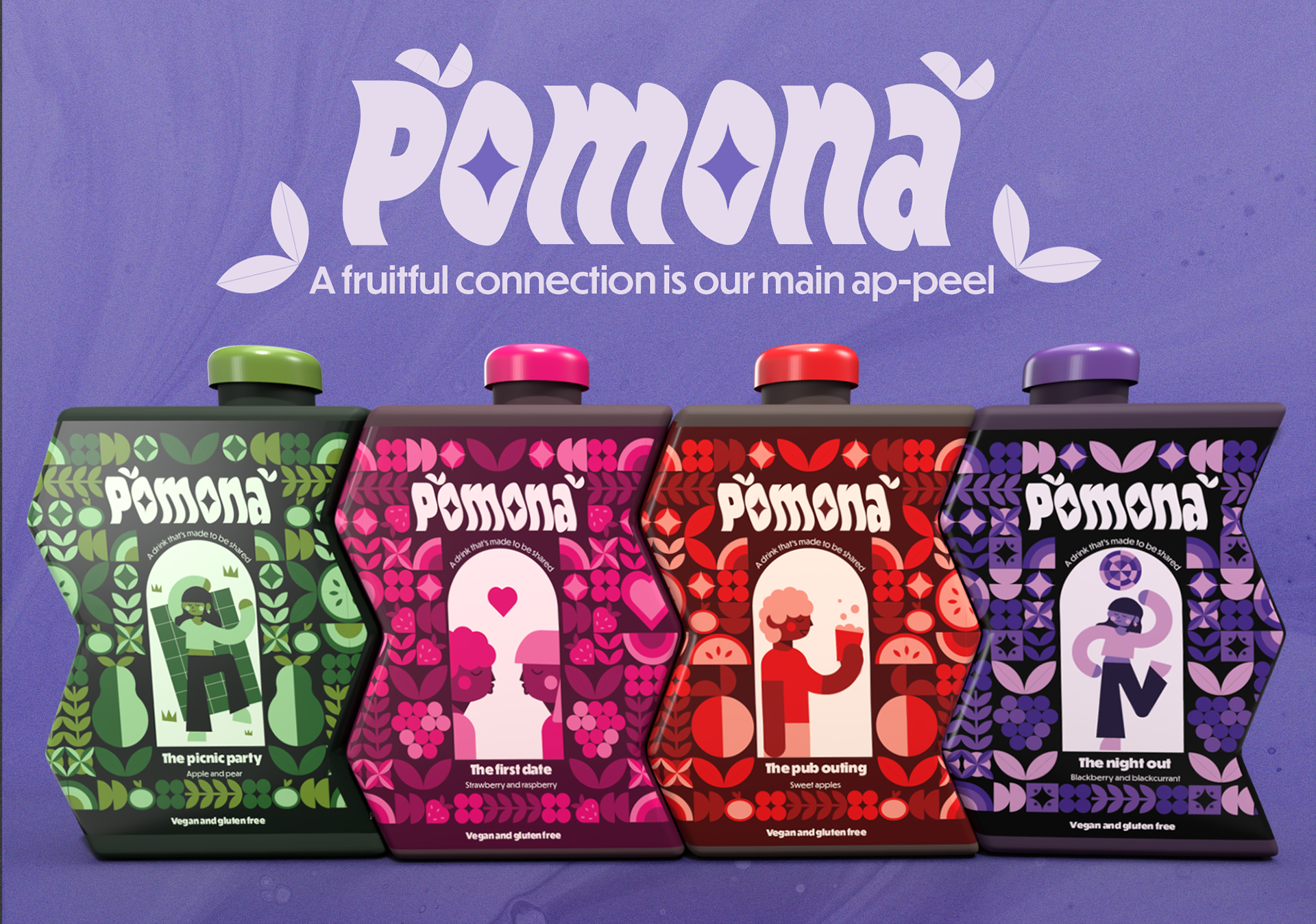
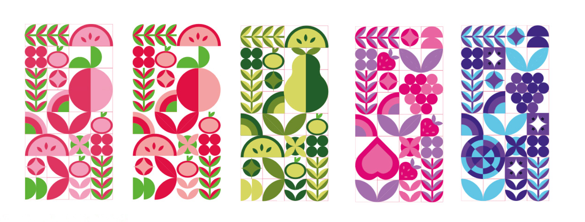
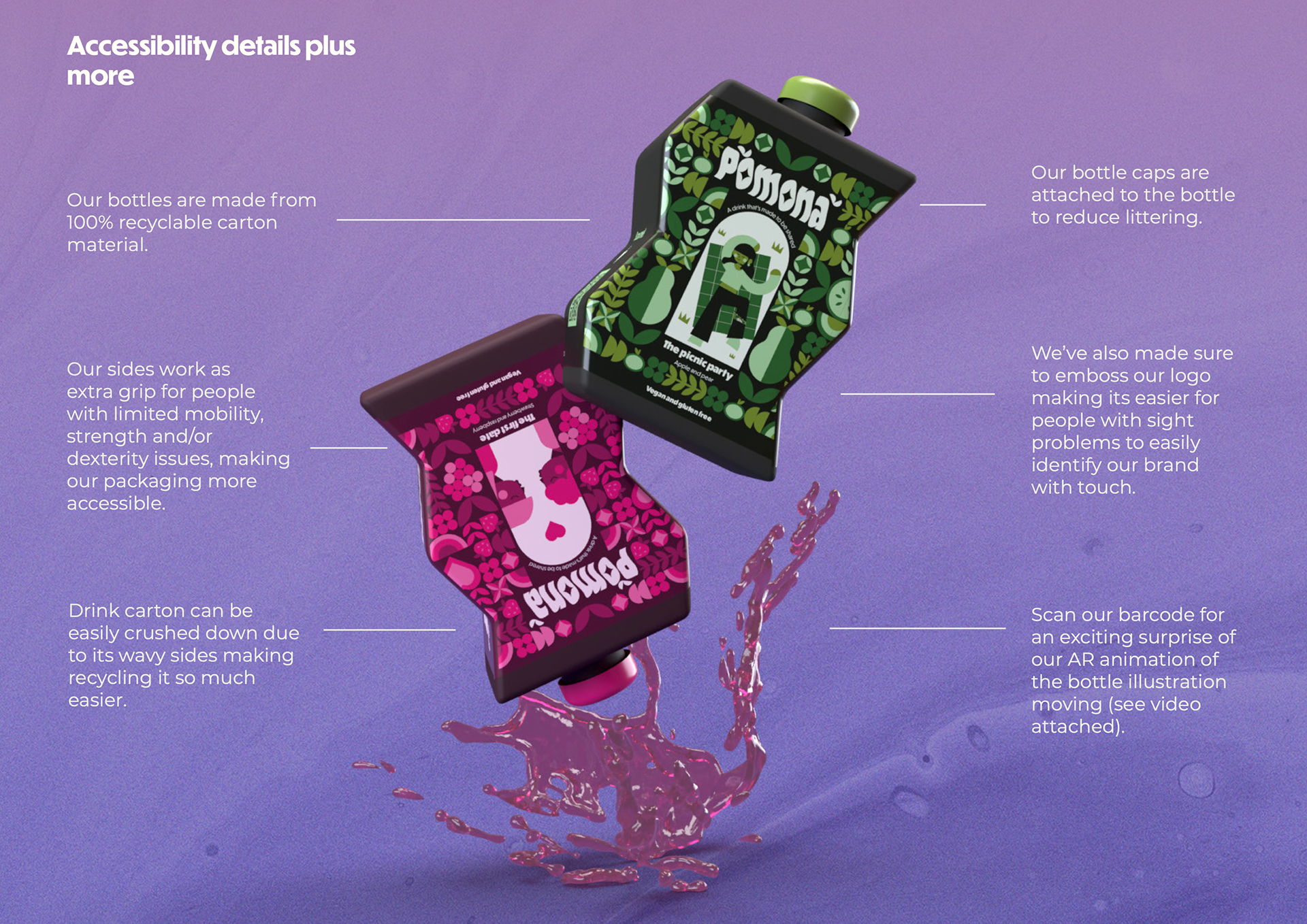
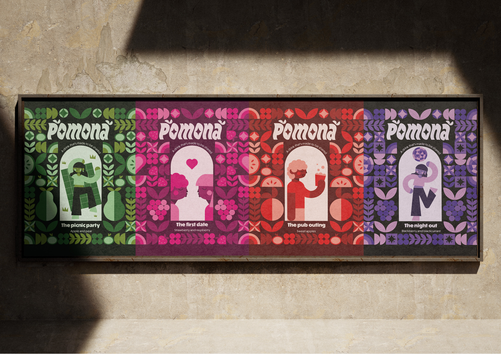
Pomona’s branding identity uses geometric shapes and repeating patterns that can be connected to each carton, creating an endless puzzle pattern to celebrate how cider can be connected to so many different kinds of people. The zig-zag shape of the bottles also reflects this value as well as act as extra grip.

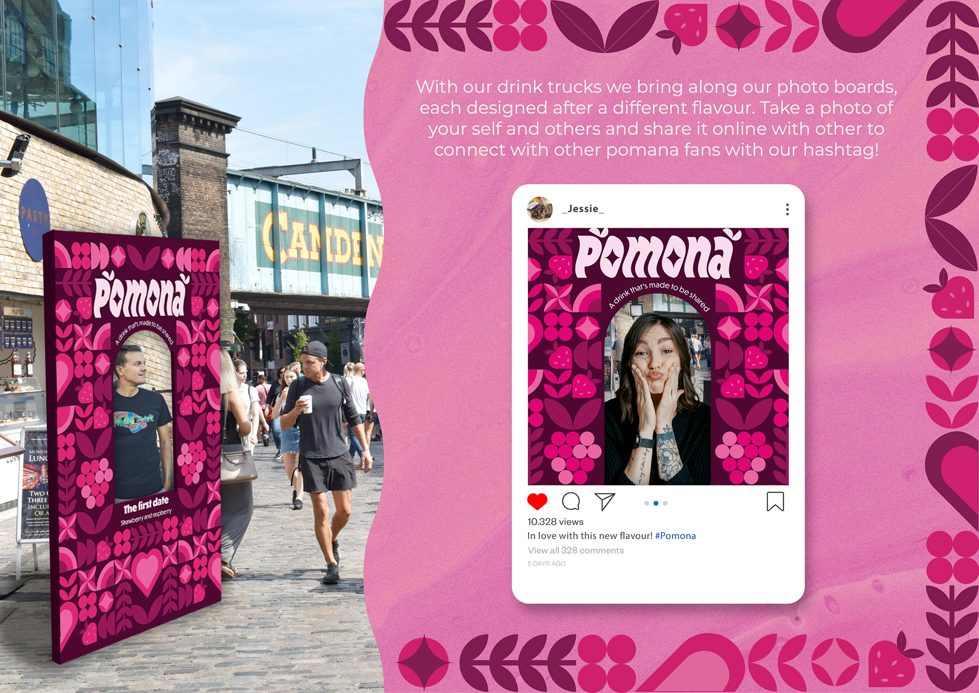
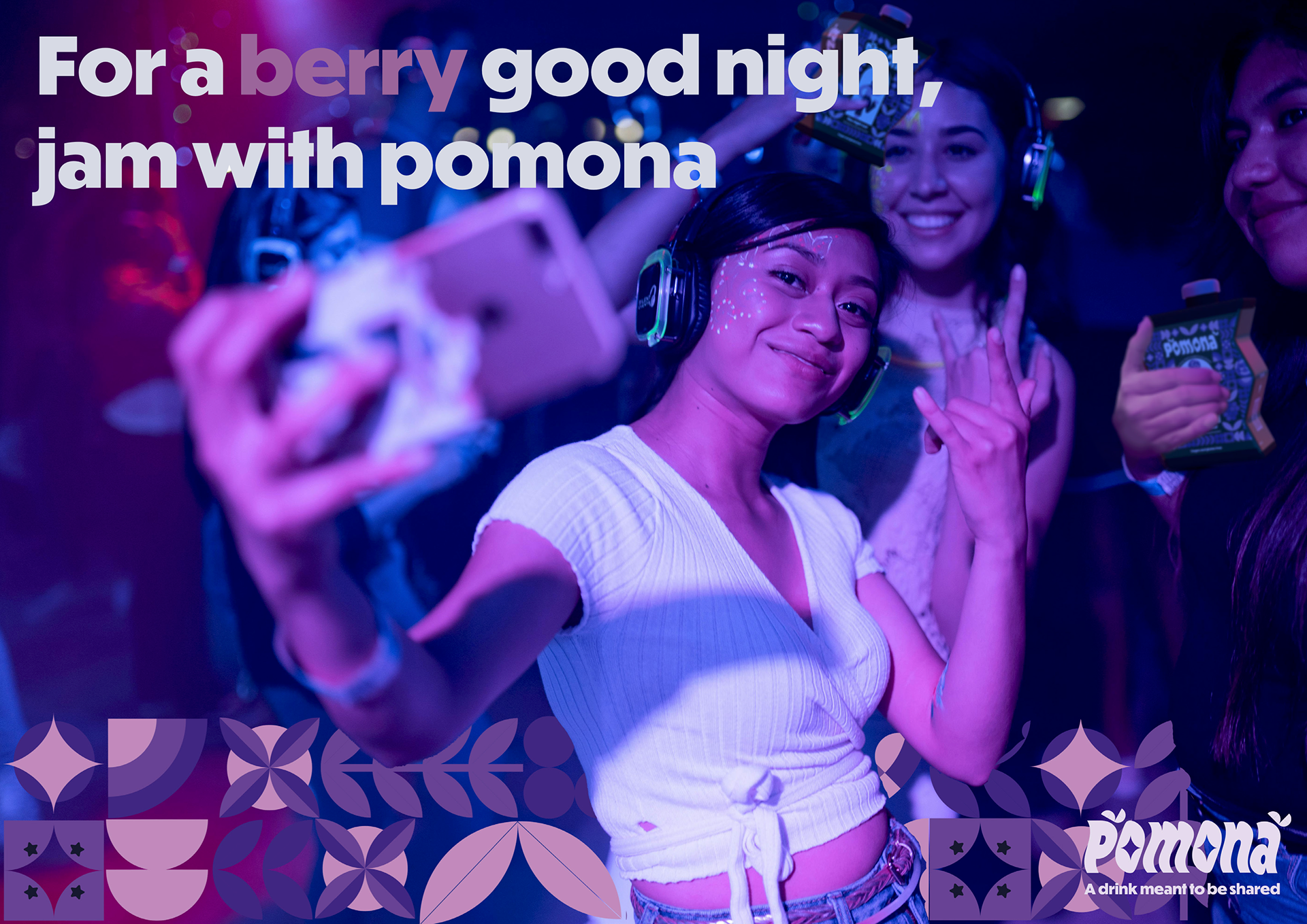
Wayfinding for Pomana includes billboards, drink trucks for festivals, markets and a Photobooth that can be found at various club nights and bars associated with Pomana.
Promotional material
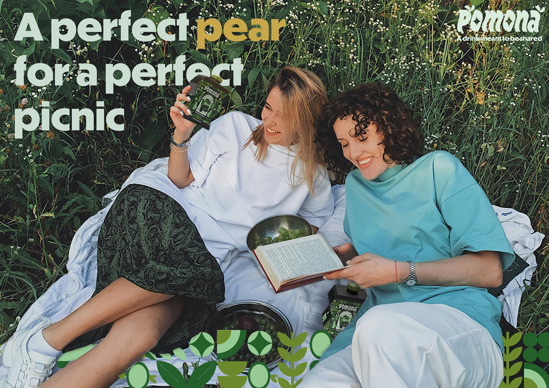
Promotional material utelises the geometric patterns as well as using dimension and photoshop to add in my cider bottles. To go back to pomana's fun and playful values i decided to use puns for my advertising.
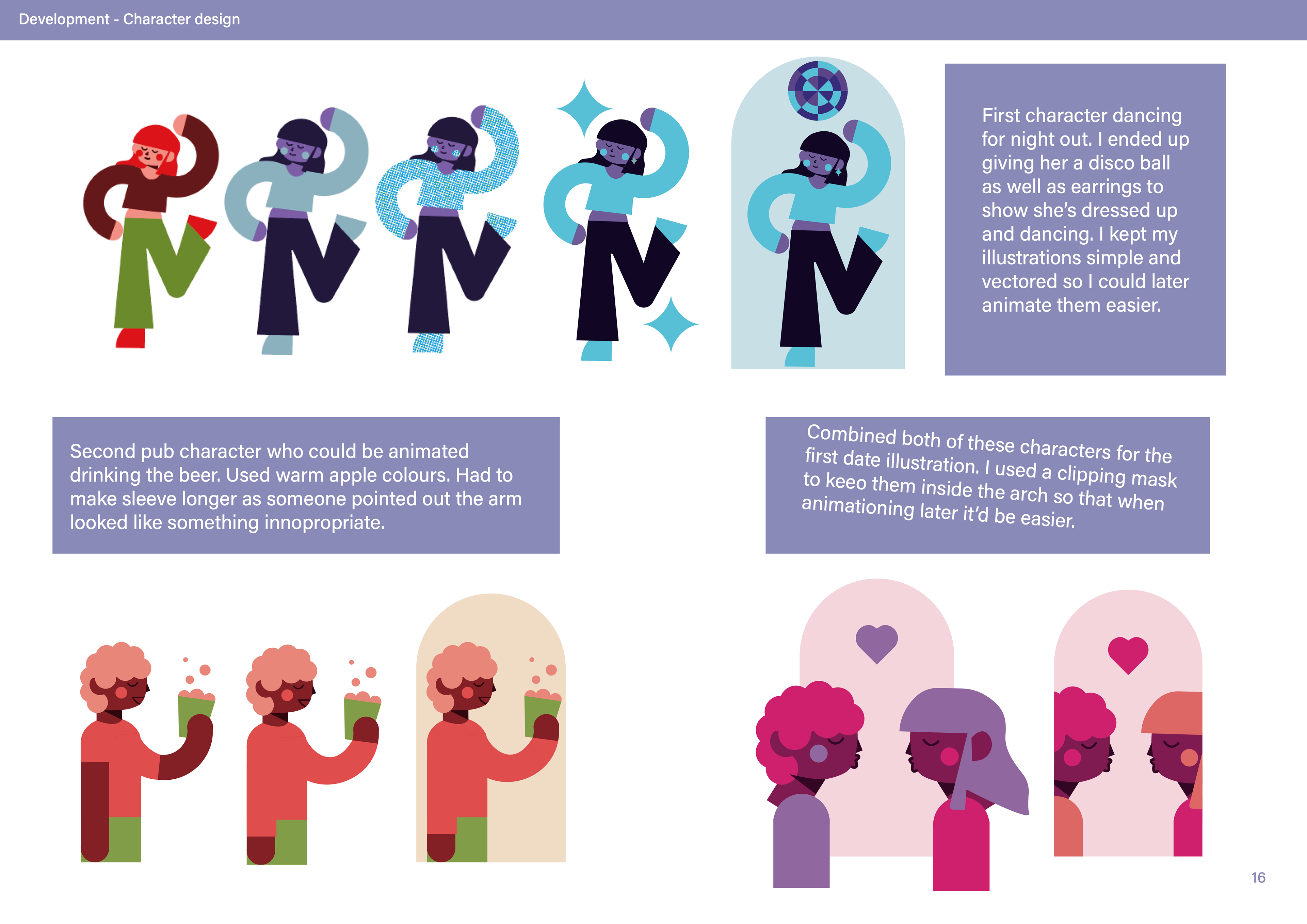
Development